We aimed to use a wide range of media technologies throughout the process of creating our media products. This was not only to produce a professional looking piece of work which was similar to the real media texts we consume in every day life, but also to maximise our own learning experience and to develop new skills and understanding of working with media technology.
Construction
In order to construct our media products, we used a variety of specific technologies to create a piece of work which conformed to the conventions of real media, as well as looking genuine and believably professional. For example, we used Adobe Premier Pro to fully construct our video and realise our creative vision which we had planned out intricately in a series of mood boards, storyboards and sketch book. Adobe Premier Pro allowed us to use cutting tools to ensure that the shots used fell on the beat of the music, a convention of real media we had realised during our research and decided that it was important to replicate in order to have a realistic product. We also used a cross fade to fuse the shots together in a more eloquent and softer manner, as opposed to fragmented and abrupt shot changes between narratives. In addition to this, Adobe Premier's effects allowed us to employ a slow motion effect to a 360 degree rotation shot used during the bridge of the song which produced more sympathy from the audience for the characters as it was a pivotal moment during the video whereby the two narratives came together as one.
Furthermore, another area of media technology used to construct our product was a Canon 600D DSLR camera (often used with a tripod). This camera in particular had multiple setting which were ideal for both our indoor and outdoor filming, as we used a contrast of home-like environments as well as pastoral settings for our narrative. The 18 megapixels within the camera's technology allowed us to produce clear and professional shots which were the correct light setting and environmental election (due to the 63 zone metering which ensures correct exposure in lighting conditions). A smaller piece of equipment, but nonetheless of great importance to the quality of our constructed video, was the tripod. It ensured that our shots were steady, and it was used in particular in producing more complex shots such as our arial shot of our actress packing a suitcase, as well as a medium shot from inside the wardrobe.

(An example of how the DSLR camera that we used was able to intricately pick out the light elements in the focus pull, such as the dew on the leaves)
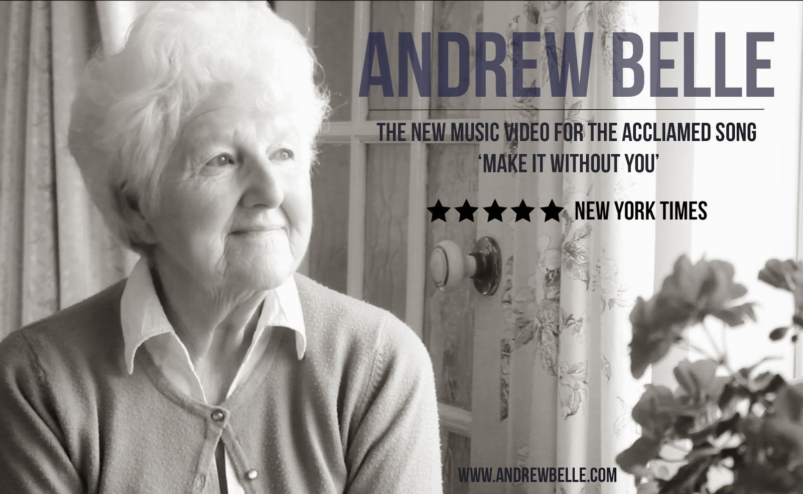
Additionally, we used Adobe Photoshop for both the CD cover and the poster for the print media aspects of our product. The text tools available on Photoshop allowed us to add in text, such as lyrics, and move it around the chosen image for the most efficient and legible structure. Furthermore, the text tool was pivotal in creating our graphic 'cube' text design on the front cover of our CD case, a convention of Andrew Belle's existing media which we found during our research. What's more, we successfully learned how to heighten the contrast of some of our chosen images to create a more abstract photograph, again a convention of both the genre and Belle's own media.
(Our CD cover, the abstract text layout created via Photoshop)
We also attempted to use the blur and dodge tool on Photoshop to create a better quality image for our advertisement. When we changed the contrast of the image to black and white, the image of our actor appeared very grainy and not as good quality as we would have liked it to be presented as. Using the blur tool allowed us to create highlight in the image on dominant facial features, such as the cheekbones and the nose, and the dodge tool aided to create low-lights and contrast. However, when faced with the final product we were unsure that the photograph matched our aesthetic vision for the poster, and decided against using the edited version altogether. This use of media technology helped us to gain a broader understanding of image manipulation, however, we decided to stick with the original and unedited image for an overall better quality product.
(A copy of the black and white image we edited)
Furthermore, we used the site
www.dafont.com to find a suitable and unique font for our digital media. The website boasts thousands of original and non-copyrighted fonts to download onto MacBook software. We tried to choose a simplistic font which would fit well with the conventions of the genre, and also would not take away from the images. We used Babueas New for the advertisement and the CD digipack to create a synergy and a likeness throughout all of the media.
(The back cover of our CD digipack, using the chosen font, as well as demonstrating the added layers).
Moreover, using the 'layers' tool on Photoshop was useful in terms of being able to move around the text and the additional images to create a professional looking back cover. For example, we selected the text as a whole layer and was able to move it around to match up with the far right hand third of the image (in terms of the Rule of Thirds). In addition, we were able to add new layers to the image, such as a barcode, a logo for a record label, and smaller titles such as a producer and rights. Using this media technology all helped to create a professional looking set of products which realised our aesthetic vision.
Selecting suitable software for the construction of the music video was essential to creating a professional and effective product. We chose to use Adobe Premier Pro on MacBook software in order to realise our creative vision. With over 2 hours of footage, Adobe Premier allowed us to watch the whole 'raw' sequence without having cropped or edited it yet, and we were able to then use the software to select the areas of footage we needed using the crop tool. Adobe Premier also allowed us to realise the convention of real media of cutting on the beat, something we were extremely eager to use in our music video, in which Belle's music had such a strong and definitive piano beat to cut on.
In order to further create our aesthetic ideas, we decided to fully utilise Adobe Premier's ability to manipulate the video footage. We used the black and white tool to change the overall visual contrast of the video, and (as previously stated in previous posts) were able to create a black and white effect on the present day parts of the narrative, and heightened colour for the flashbacks. In turn, these colour effects had an effect on our audience's reception of the video, as individuals commented that the black and white made the video more moving and emotive.
(Our use of black and white contrast, made possible by Adobe Premier Pro)
Additionally, we were able to use Adobe Premier's effect of the 'cross dissolve' to create a fluidity between shots. This was especially important for creating a difference between the narrative and the performance element, without it being too much of a drastic change in the eyes of our audience. The 'cross dissolve' enabled us to create a slow and faded movement between shots and cut sequencing, which also fitted well with the slow tempo of the song, and didn't disrupt the audience's existing schema of the video genre (being that of an emotive and slow song).
(An example of the cross dissolve in our video)
Adobe Premier Pro also allowed us to play around with the temporal relations of the video which we were creating. We had one long shot of the two females of the video embracing, and saw it as a particularly emotive shot which could be used at the bridge of the song. However, it wasn't as emotive as we would have liked for it to have been at it's current speed. This is where Adobe's time manipulation really came into play, and we were able to slow down the speed of the visual and create a slow-motion effect at the bridge of the song, which turned out to be exactly as we had imagined it to be, very heartfelt and moving.
(The long, 360 degree shot used in slow motion at the bridge of the song)
Research
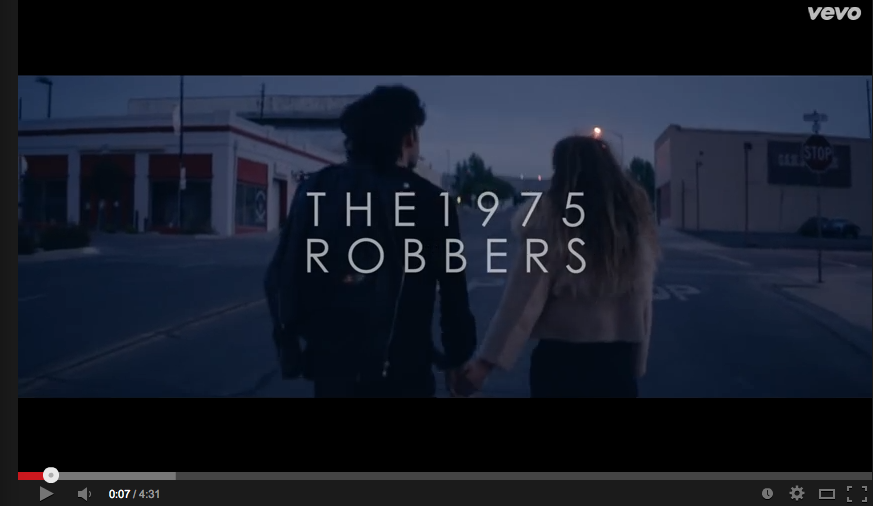
The research that we carried out in order to understand conventions of real media texts and the genre of music of our song was extremely valuable. As previously seen on our A2 blog, we used social medias and video sites on the internet such as YouTube to locate music videos of typically alternative genres to establish the predominant shot types and eclectic narratives which varied in the media today (for example, Robbers by The 1975, and Notorious BIG). These particular artists were very different to that of Andrew Belle, but each gave us an understanding of the professional music productions existing on media platforms today, and the knowledge that we gained during the process was invaluable. For example, in watching 'Robbers', we were able to see how cutting on the beat of the music creates a more engaging pace for the audience which links the song well with the video.

(The 'Robbers' video for The 1975, shown on Vevo on YouTube)
We then focussed in on more applicable videos which were similar to Belle's own genre to understand the conventions of this media. We saw in videos by Tom Odell and Mumford and Sons that a strong performance element was key to the video in demonstrating the artist's talent. In a way, this convention comes from the very roots of the genre, as many of the acoustic folk artists circulating in the media today have all come from self-startup backgrounds, having a particular musical skill, be it piano or guitar. We knew from this research that in order to shed light on Belle's own skills as an artist, and to create a direct link to him in our video, we too needed to provide a small performance element that would not take away too much from the narrative.
(An example of a performance element included in an acoustic folk video, Mumford and Sons, Little Lion Man)
Furthermore, using Google Blogger to present our progress was an extremely useful piece of media technology, and it acted almost as a portfolio of our work. We were able to not only document our research and all of the images we had of evidence of our planning and development, but it was also an excellent way to document everything, a way of being able to look back on what we have done and our initial ideas. Also, as Blogger can be used from any computer under one login account, we created a group account so we could all put in equal amounts of effort towards the writing.

(A print screen of our live blog)
Planning
In terms of the planning we did towards our music video, we started with our preliminary. Getting to grips with the new media technologies available to us, and the various conventions of music media was vital to understanding where to start. We began by creating a lip-syncing video to try out how we could use the camera to capture the initial video and then edit the music to fit using Adobe Premier. Despite it's complexity, it was surprisingly easy to get on board with, but after deciding on our piece of music for our video and realising that lip syncing wasn't necessarily a given convention of the genre, we decided against using it.
(An example of on
We expanded our research and planning stage by trying to understand Belle as an artist. On visiting his online webpage (
www.andrewbelle.com) we were able to collect more information on Belle as a person, as well as get an idea of his online presence. He displayed artistic images (mostly in black and white) both of himself and stills from his existing music videos. His website also included numerous social media links as well as information about upcoming and past tour dates. Gaining a wider understanding of Belle helped us to learn more about his place within the acoustic genre and about how he markets himself and his products.
(Andrew Belle's website page)
Evaluation
Using a range of media technologies during the evaluation was key, as part of the specification states that a wide number should be used to display the information. We decided to present each of our evaluation questions with a lengthy and in depth blog post, each accompanied by another media technology such as a Prezi presentation or a video. We used Prezi twice to visually display our ideas for two of the evaluation questions, and it allowed us to present the information in a more creative medium. Additionally, we filmed a video response to our production and asked a small audience some questions for a focus group. We then uploaded this to Youtube and linked it to our Blogger posts to share with the remainder of our media portfolio.
(A screenshot from our focus group video)
(An example of one of our Prezi presentations)
We used an online software called Surveymonkey in order to create a questionnaire for feedback on our music video. It was relatively easy to construct, using tools to create drop down menus, multiple choice options, as well as text boxes to collect qualitative data (personal opinions from our audience). We decided to go for under ten questions to keep the questionnaire short and easy for our audience.
(Evidence of our Surveymonkey questionnaire)
We understood that the evaluation also needed to be reflecting upon the ancillary texts as well as the music video. In doing this, we used another media technology, Slideshare, to record the results of an interview between two of our media peers about the ancillary texts. Slideshare is very similar to Microsoft Powerpoint, but it is accessible via a Macbook online, which was very useful for us. We were able to present each response on a separate page.
(Our Slideshare document of audience feedback)
In terms of our post production evaluations, we used social media (namely Facebook) to share our Surveymonkey link to gain as many responses to the questionnaire as possible. As Surveymonkey produces anonymous results, it is unclear to us as to who responded after following the Facebook link and who responded by finding the survey at random. However, we were very pleased with the responses we got on Facebook, as many people commented praising our work and congratulating us on our progress.
(Our use of social media during post production)
Molly Masters


