We understand that the demand for this particular evaluation question is that, in order to answer how effective the combination of our products is, we need to be able to demonstrate synergy across all three: the music video, the poster advertisement and the digipack CD. We also need to show how the products will be identifiable to the audience, and demonstrate how our products meet the required and recognised conventions of the song's genre.
After having finished the music video, it was necessary for us to create a series of products to correspond well with it; using the existing genre, conventions and ideas which we had created within the video. We decided to use a medium close up shot of our actor posing as Andrew Belle for our poster. Based on our research of other artists of the same genre (seen in previous blog posts) such as Ben Howard and Ed Sheeran, we could see that this was a convention. The idea surrounding the poster was to market Belle as a person, as the face behind the music that is not always seen on the front cover of a CD. In addition, the use of a close up and strong eye contact increases the connexion between the artist and the audience, and is a factor which stimulates engagement.
(Our poster advertising Belle's tour)
With reference to Andrew Goodwin's theory of 'reoccuring motifs', we used the same actor featured in the video and print media. This links together the two pieces of media, as well as including Belle as an artist directly with his productions (as our actor is posing as Belle). This creates a sort of synergy between all of the productions, as the same person is recognisable throughout.
(A still from the music video of the same actor, Lewis, acting as Andrew Belle in both the print and moving image media)
(The front cover of our CD digipack)
(An example of Belle's existing album artwork)
(There is a sense of coherence created throughout our print media, in that the piano is used throughout to signify the genre)

(An example of synergy across Lewis Watson's own real media)
In terms of the inside panels within our CD digipack link to the video itself, again creating an effective combination and link between the two. We have chosen to use still images taken from the video to use as backgrounds to the lyrics. This creates a direct link to the video for the main single on the album 'Make It Without You', and also provides a fluidity. The use of the pictures of the actors in their most iconic and emotive shots also add to the continuation of the genre and the key themes reflected in Belle's lyrics. So, with this in mind, we used the most emotive shot of Anne on her own to be the background for the 'Make It Without You' lyrics, as it links well with what Belle is singing about.
(The still of Anne used as a background for lyrics)
Additionally, the other two images that we chose to use for our inside panels of the CD digipack were artistic and symbolic, furthering the themes of loss, love and nature reflected in the lyrcis, and as a convention of the genre. For example, the inside panel with the trees links to the pastoral setting and root of the genre, and also, the church windows further connote solitude and are slightly reminiscent of death.
Synergy of All Three Productions
We were keen to ensure that there was clear synergy across all of our three media productions. We wanted each to echo the others, and for there to be distinctive links between them all which would aid to market Belle's music clearly and effectively to his demographic audience. We started realising this idea by using a black and white contrast across all of the productions. Being a clear convention of the acoustic/folk genre, we knew that this would signify the genre well, and using the same colour scheme across all of them would create this synergy. As previously stated, we chose to use black and white in the 'present day' parts of our video narrative to connote the solitude and sadness of which the song lyrics reflect on, and to continue these key themes coherently, we also used a range of black and white images throughout our CD digipack and poster too.
(The synergy of black and white across all of our productions)
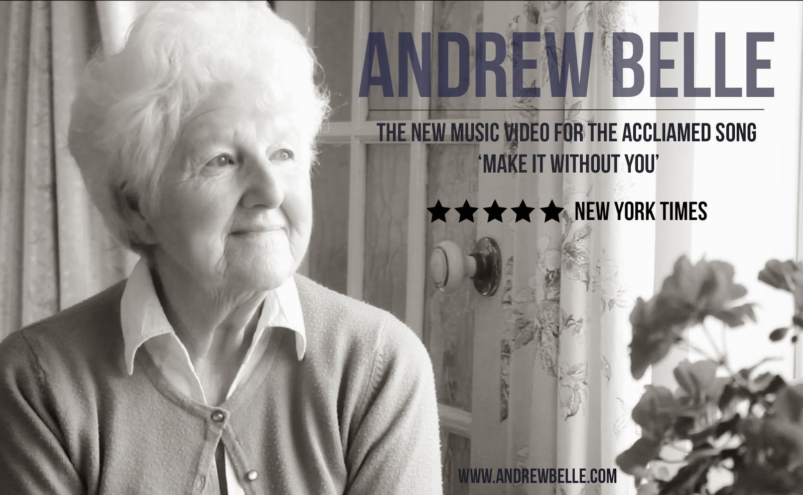
Another way in which we effectively combined all of our media products was by the use of stills from the music video both in the CD digipack and in the advertisement for our video. We felt that in doing this, we created an effecitve link between the song (as the most popular single on the album), it's video, and the album. The image of Anne (our actress) that we have used has almost become an iconic image of the video and digipack, and in using it across all three productions, it has successfully become a recognisable image for the audience.

(The poster to advertise the music video, using the iconic image)
How are our products identifiable to the audience?
As a reflection of all of the information given above, our products become identifiable to the audience through the use of synergy and recognisable use of the conventions to signify the genre clearly. For example, the consistent black and white colour scheme, the abstract album artwork, the cohesion of piano shots and images, as well as the continuing narrative and characters throughout.
Molly Masters


No comments:
Post a Comment